Recognisable Brand Mark
A bold name treatment with a grocery cue built into the identity.
CONCEPT WORK
Brand identity, retail and campaign
THE OBJECTIVE
Define a retail brand direction for Agorus that feels simple, recognisable and suitable for everyday grocery shopping, while keeping value, trust and family needs at the centre of the concept.
OUR APPROACH
We shaped the presentation around a warm red and orange retail palette, a clear grocery symbol and direct customer language that can work across brand, store, campaign and digital touchpoints.
VISUAL STORY
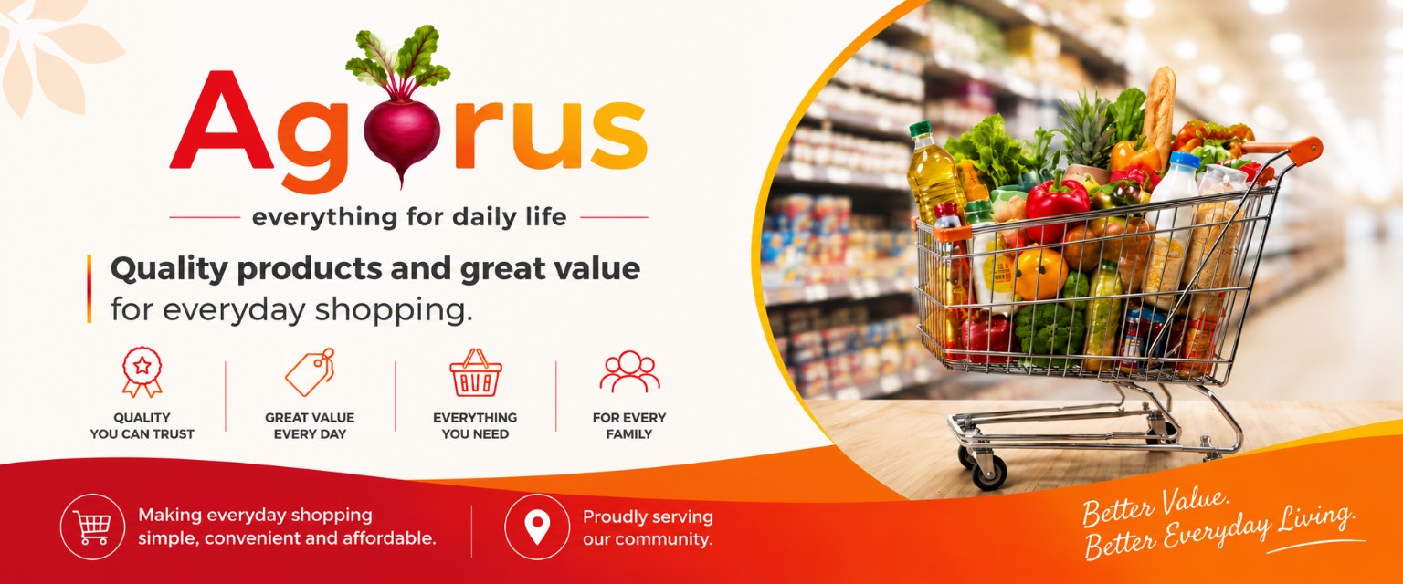
The Agorus visual system uses the brand mark, grocery basket imagery and everyday value messaging to present a retail identity that is bright, practical and easy to understand.
A bold name treatment with a grocery cue built into the identity.
Simple value-led copy for regular household and family needs.
A visual route for grocery offers, store presence and launch assets.
BRAND MARK
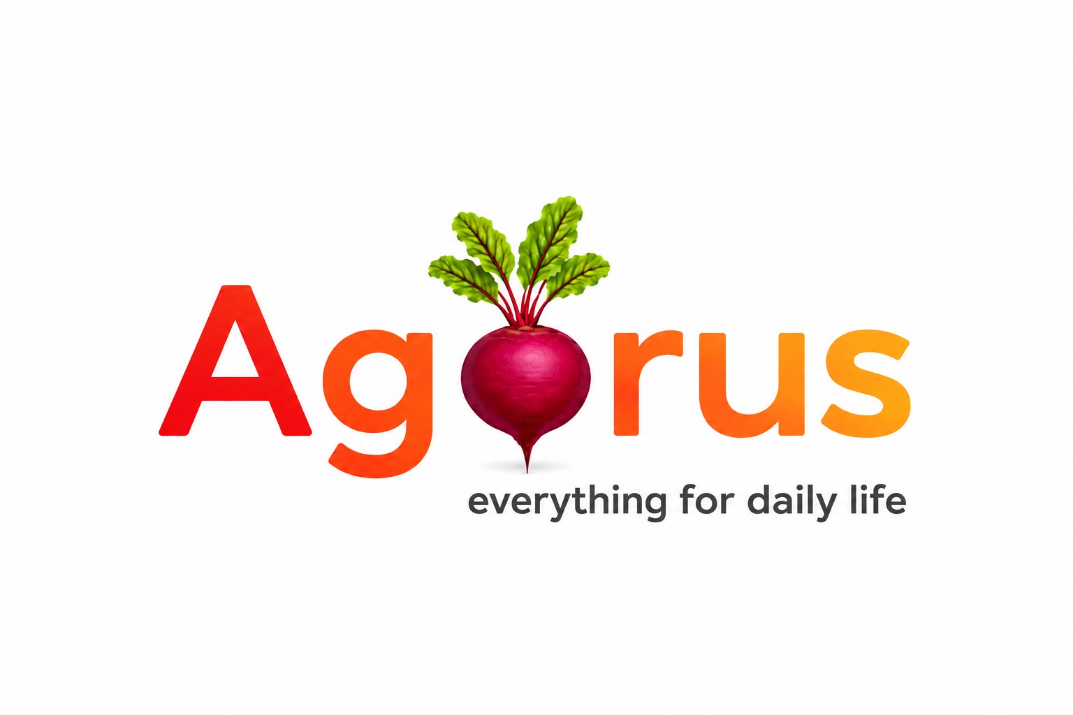
The logo concept keeps the name large and memorable, with the grocery symbol placed directly inside the word so the retail category is visible at first glance.
WHAT WE DELIVERED
CONCEPT OUTCOME
The concept gives Agorus a clear retail identity direction and a practical campaign structure for presenting grocery value, convenience and daily shopping needs.